
One of the guest presenters in the free online event I watched in October was a guy who’s a big gun in book cover business. He talked about what you should never put on your book cover.
No scenes. No specific details (from the book, I guess). No drop shadow ( it looks too 1980-ish. Like Fabio Lanzoni.)
So, no Fabio Lanzoni (just joking.)

My parents, cca. 1960.
No eye contact (with the reader) performs better than eye contact. Partial faces (from nose down) are better than full faces.
Other common mistakes: Too much of anything.

“Singing in the rain.” The cute one
Expressions on the faces that show (or try to show) their relationship (I wasn’t sure I noted this one down totally right, but I think I know what he wanted to say.)
Don’t do it yourself unless you know what are you doing (know about cover design).
All this makes sense.

The idea of my PhD paleographer
Then he emphasized something that I should accept sooner rather than later since I have a reputation for being a difficult customer: Let the designer do her/his job.

“I survived the Battle of Blackwater”
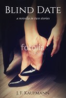
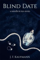
Sure. Providing she/he cares about your book. When my first designer (for Blind Date) sent me a couple of her suggestions, I was disappointed. She missed capturing the essence of my story even though I sent her the summary, blurbs, and notes about the characters. One (semi-sepia) image had a middle-aged couple from the times of JFK’s administration, sitting on a bench. The second should’ve represented the idea of my PhD heroine with an IQ of 150, but suggested some cheap erotica. On the third image something was wrong with the woman’s facial proportions – her nose looked like a crossover between those of Lord Valdemort from the Harry Potter movies and Tyrion Lannister after the Battle of Blackwater. One was kind of cute — “Singing in the rain” — but again, it didn’t even hint at the passion and serious emotions of my stories.
And then they say I’m difficult.
The next four were my suggestions.


Anyhow, back to the presenter. Focus on colors, font, text, he says. Colors communicate the genre. Go to Amazon and check the first 20 bestsellers in your genre and study their covers. Great advice.
Redesign your cover to boost the sales. Sometimes it does wonders, but it won’t do anything if your book isn’t visible (if it’s not high-ranked, but this is a whole new can of worms.)
A good cover will cost you, according to him, but I have a strong suspicion he said that just because he does book covers for living, and he is expensive. (He also writes, a lot, a book or two every year, fiction and non-fiction alike.)
Here I–and many others, more competent–disagree. I checked some of the sites he mentioned. They charge between US 300-900. Some of their covers look great indeed, some are average some below average. And I saw some great covers elsewhere for under CA $100. They’re all based on stock images, expensive ones and inexpensive alike.
I kinda lost my interest after this money bit, but the end was near anyway.
The last thing he spoke about was current trends in urban fantasy (I don’t know why UF out of all the genres, since it doesn’t seem like the hottest writing trend these days). In case you’re wondering, here it is: lots of glow coming from behind, a figure in the middle, magical elements…
Ok. Got it. Fabio is out. Glow is in.


JF Kaufmann, your four cover suggestions were great, but the last image you shared, all fingers nails and sexy red-painted lips, I loved it! Can’t wait to see what the final, Blind Date, looks like!
LikeLiked by 1 person